Good Maps vs. Bad Maps
What is the difference between a "good" and bad map?
Good maps have many different elements that produce a map that is clear and concise.Some of these elements include proper sizing, a proper legend, a north arrow, and a title. All of these elements and more describe a map in a manner to convey all the information needed for a the viewer to understand what is going on. Bad maps typically ignore implmenting the neccessary elements on a map or use those elements incorrectly. This will cause confusion for the viewer and make the map impossible to understand. For example, not including a title to a map leaves the viewer wondering what the map is showing.
Critique of Map 1

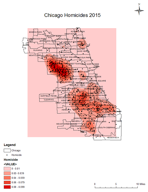
This map has a working title that descibes what the map is about, "Chicago Homocides in 2015" It also includes a north arrow which gives orientation. Those are the two things this map does well. The map includes a legend and scale bar. Both of these elements are needed for some instances, but for this map they are used incorrectley. The legend does not make the information presented more clear and the scale bar is not needed at all. The legend has numbers in it as well, these numbers are meaningless to the viewer without context. This map does not show what the inside lines of the shape are and it does not give a good sense of orientation outside of the shape. What I mean by this is that there is nothing shown that borders what is "Chicago". There is also a red rectangle/sqaure in the bacground of the map that is an awkwawrd size.
Critique of Map 2

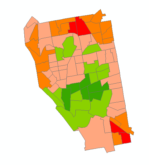
Map 2 is very confusing. First, it is missing all elements needed that identify what the map is. There is no title, legend, or description of what the map is. I have no idea what the map is depicting and the location the map is showing. The color scheme for the map is completely wrong. It shows many different colors rather thatn a color ramp of just one color. Having multiple colors like this makes the map very confusing.
Critique of Map 3

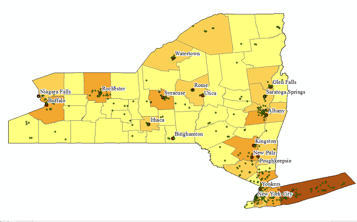
Map 3 is also missing a great deal of elements. There is no title, description, legend, north arrow, or scale bar. There are city locations, but they have no relevance to the map. The color ramp used is not needed for this map to display information. There are points on the map that are extremely small, the same size, and unidentifiable. There are lines that break New York into many small sections which are not identified on the map. Overall this map seems to have a lot going on and needs a page or two full of explanations with it in order to convey its' message.